The Woof
design system
Helping the dog food manufacturer, Ollie, create a digital experience that is effective and consistent but also playful (for dogs or designers).
ROLE
DURATION
8-week academic project
TOOLS
Figma, Zeroheight
TEAM
the problem
Ollie is a dog food manufacturer specializing in clean and simple recipes to suit the needs of dogs. While their site is lively and fun, when you take a closer look, many design inconsistencies appear.
We wanted to create a cohesive, concise, and accessible design system to minimize these inconsistencies for Ollie's design team and optimize user engagement with their site.
our solution
Using a design system boosts a company's ROI, and Ollie would be no different. With premade components and clear guidelines, designers and developers can do their jobs efficiently and at record speed. A simple and predictable user journey is also key to engaging and retaining customers.
To create this design system from the ground up, we dove into the following steps:
Deconstruction
We took apart Ollie's site to identify all their unique components and audited them for design inconsistencies.
Reconstruction
Our next step was consolidating all the styles and components in Figma, which we tested with users and published as a UI kit.
Documentation
We finalized a design system for Ollie's brand by documenting guidelines for each style and component.
deconstruction
We used Brad Frost's atomic design concept to inform how we scaled components: small elements (like buttons) were identified to build larger responsive components (like cards). This approach to components ensures design consistency.
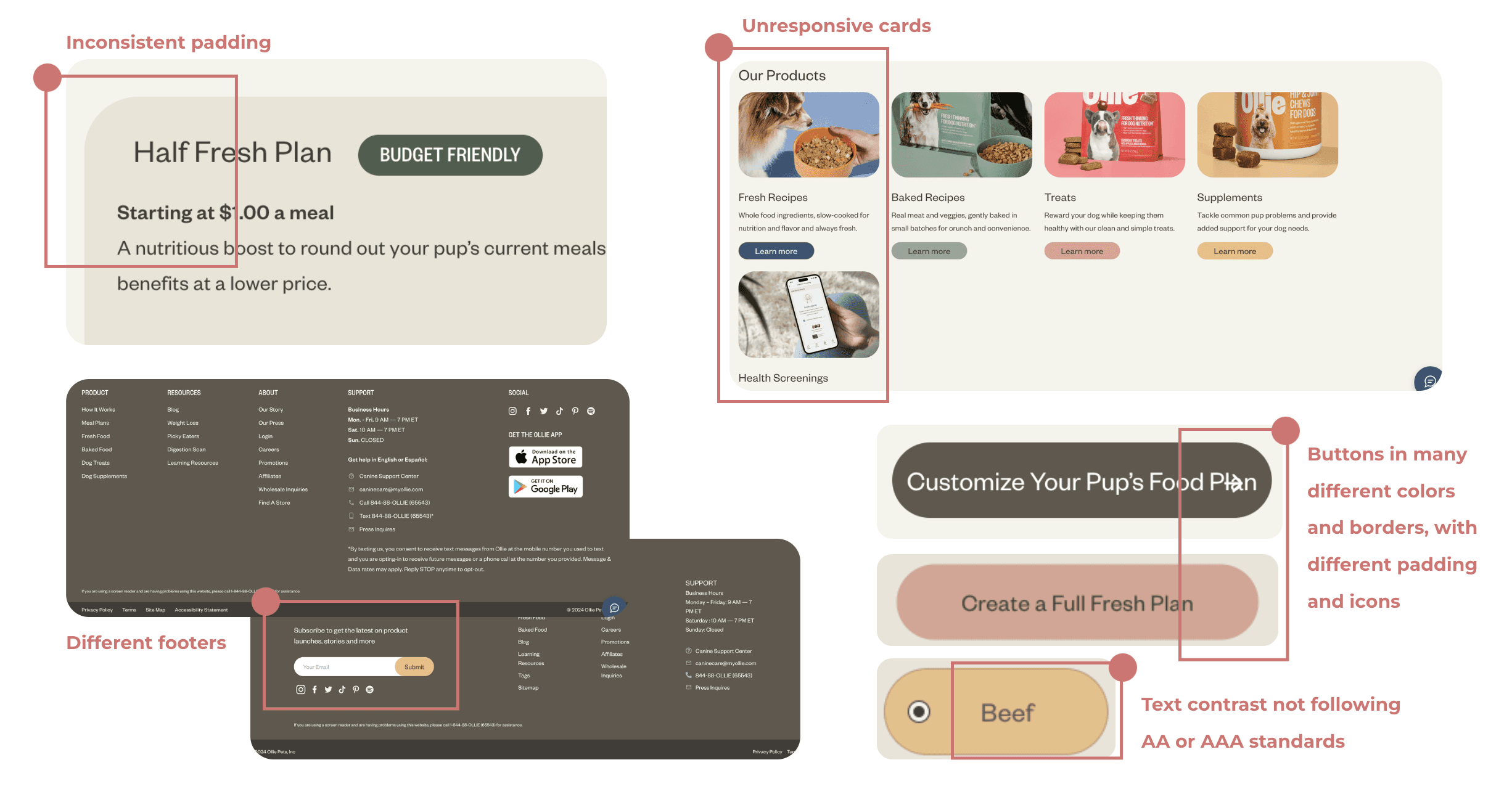
OUR FINDINGS
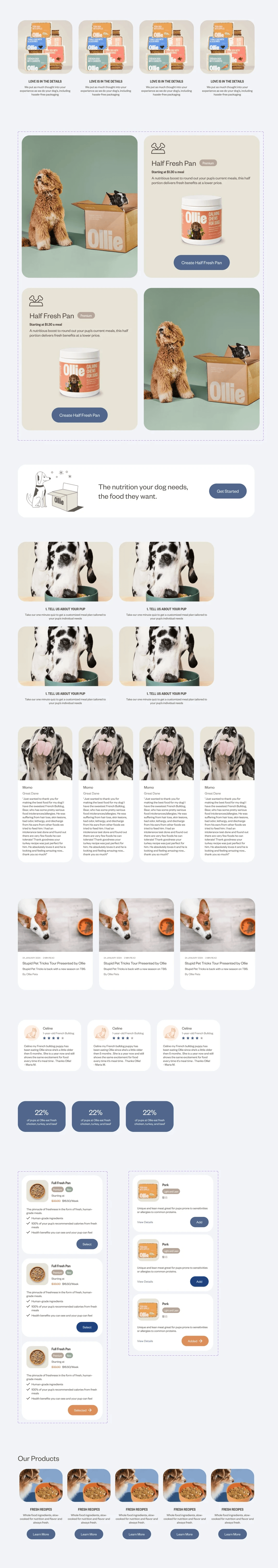
Ollie had very little unity in its design
Our inventory gave us a solid glimpse into what work needed to be done. Our primary focus would be to consolidate the many variations of components and give them firm usage guidelines so they are used purposefully, not just based on aesthetic whims, as nice as the colors were!
When designing with purpose, we found that many of these variations were just not needed.
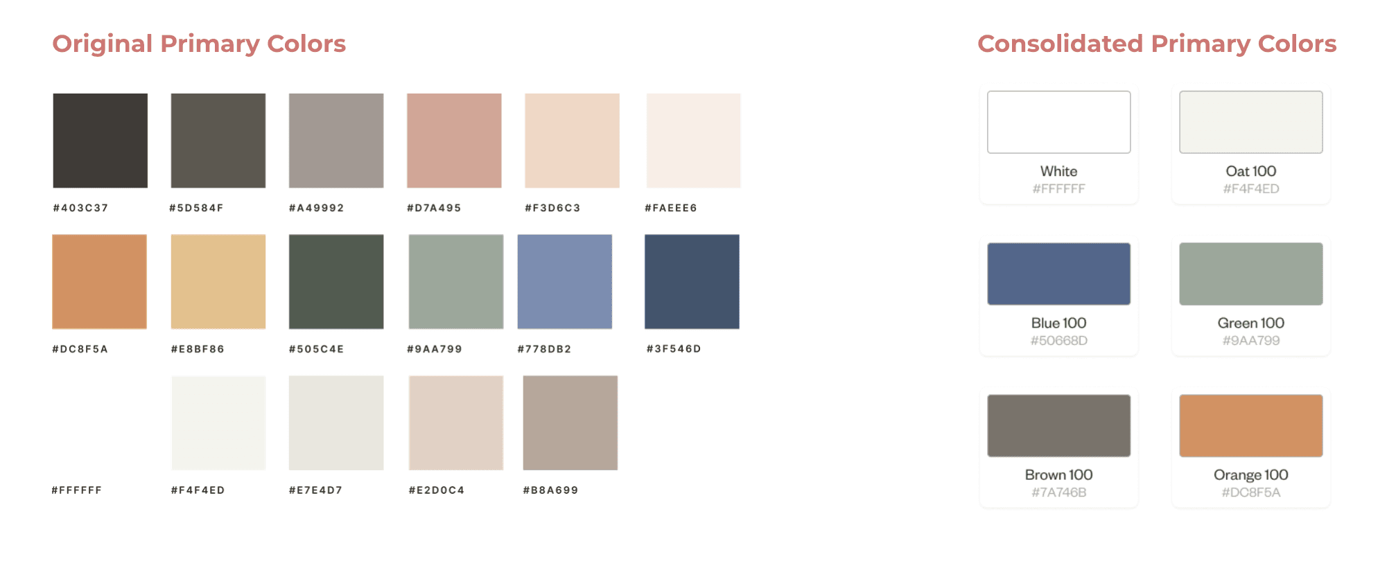
#1
There were 17 primary colors with no clear reasoning behind their use cases
#2
16 card styles were present, causing a ton of inconsistencies in visuals
#3
The site was designed for aesthetic appeal but had unreliable visual patterns/hierarchy
reconstruction
We analyzed Ollie's values as a company and used this to inform the intended impact of our design system on users. Ollie values simple and transparent ingredients, showing care for the dogs they feed. We wanted to show the same care to designers!
That's why we made the following design principles:
Simplicity
Woof maintains a balance between simplicity and aesthetics, much like the simple food ingredients yet fun product design used by Ollie.
Empathy
Ollie always thinks of dogs' health, making food that works best for them. Woof ensures all components work harmoniously to provide users with an intuitive experience that meets their needs and preferences.
Cohesion
Ollie is dedicated to providing high-quality formulas. Woof follows its own strong formula, making a cohesive visual identity for the brand.
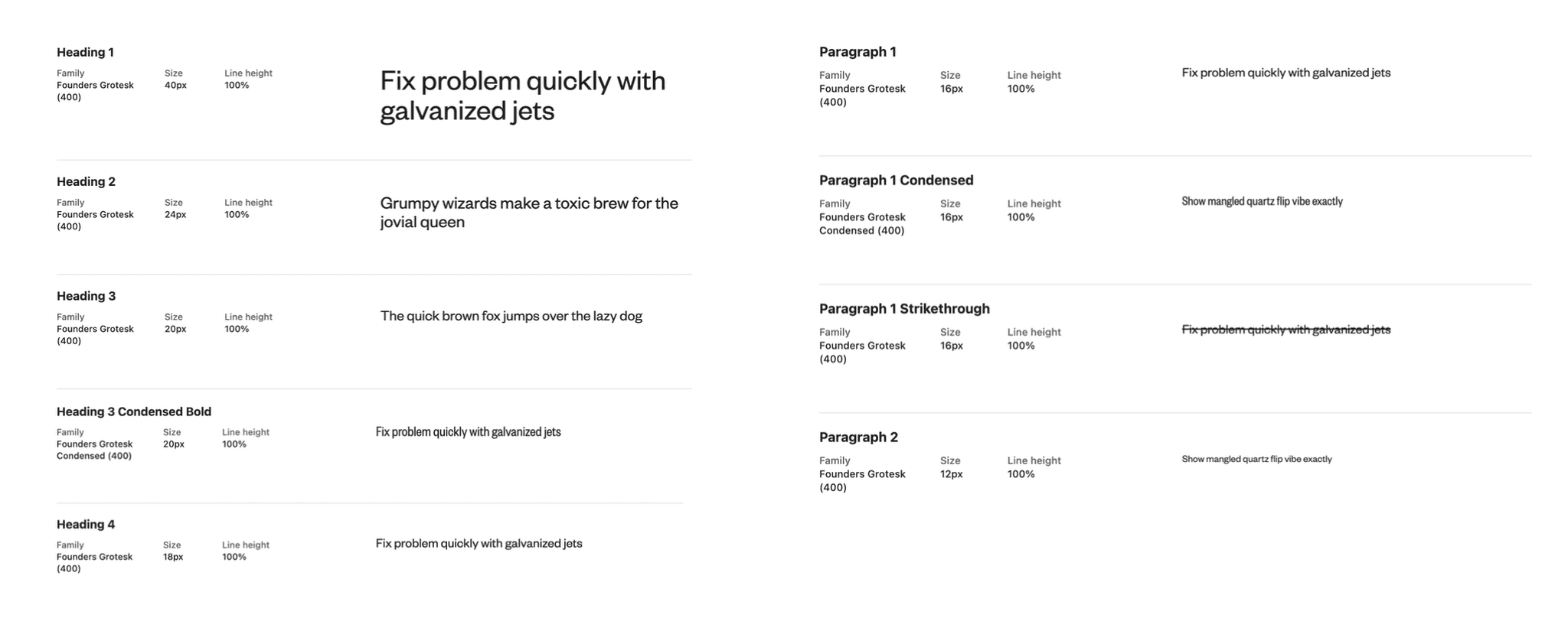
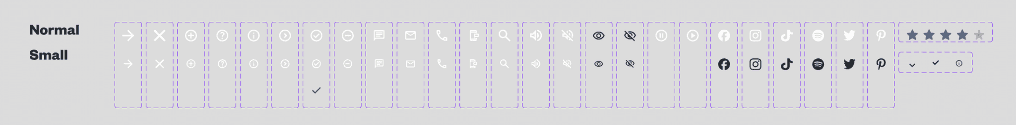
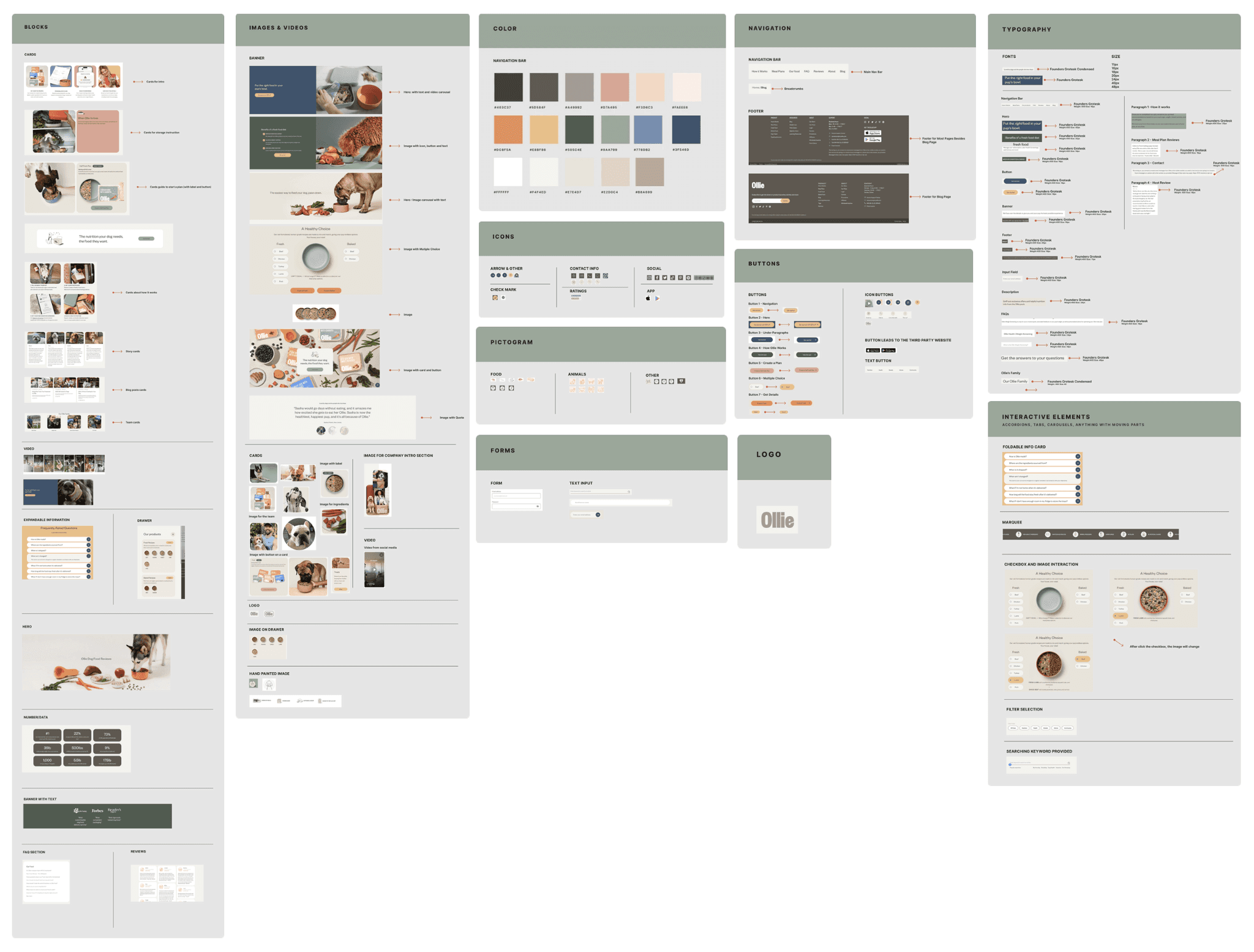
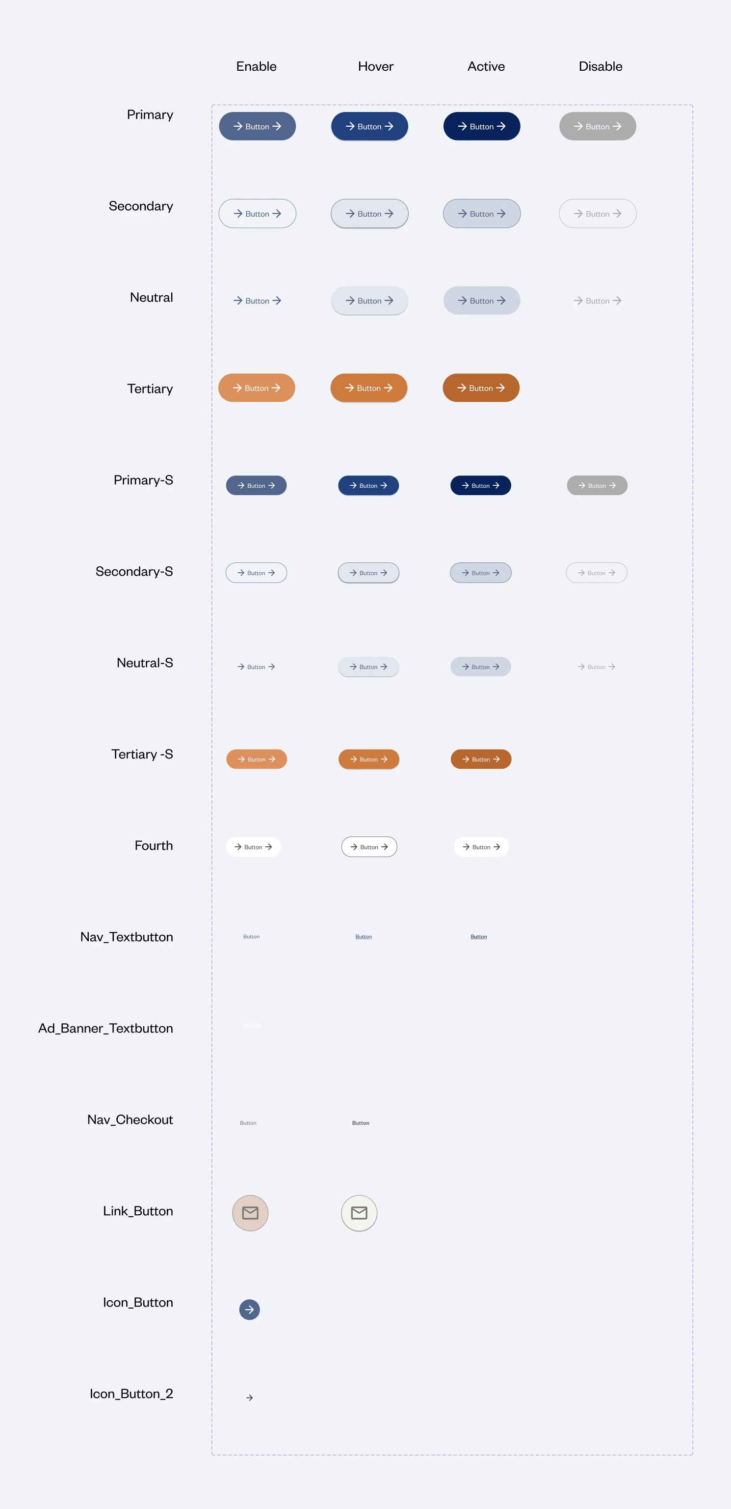
COMPONENTS 101
We built properties for our foundational components
We introduced the smallest components to a hierarchy system with changeable properties to suit the many needs of designers. Buttons and text links, for example, had some of our most extensive properties. These small design pieces were perfected to create consistency with our most complicated components, like cards.
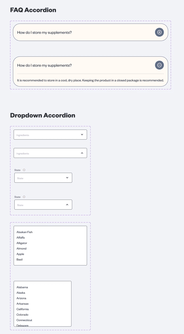
Other components include input fields, accordions, badges, and dropdowns.
Properties included showing/hiding icons, text inputs, colors, sizes, and hover states
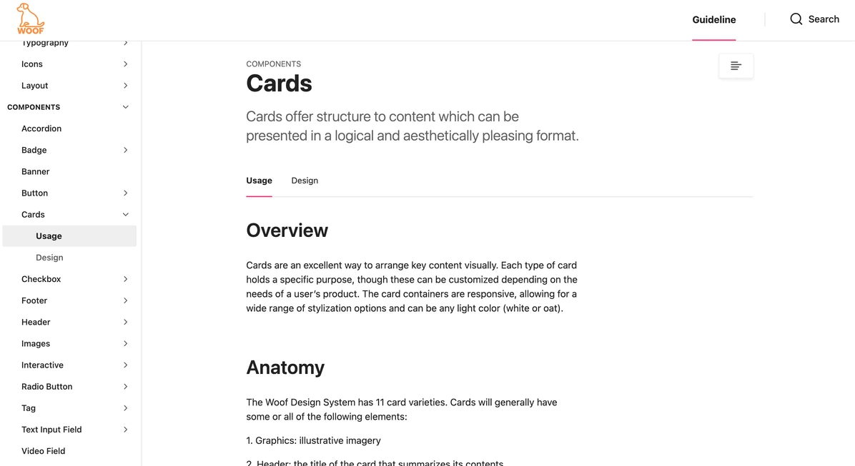
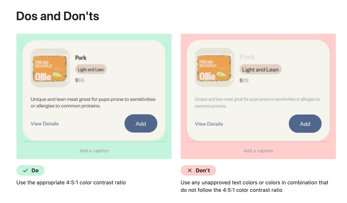
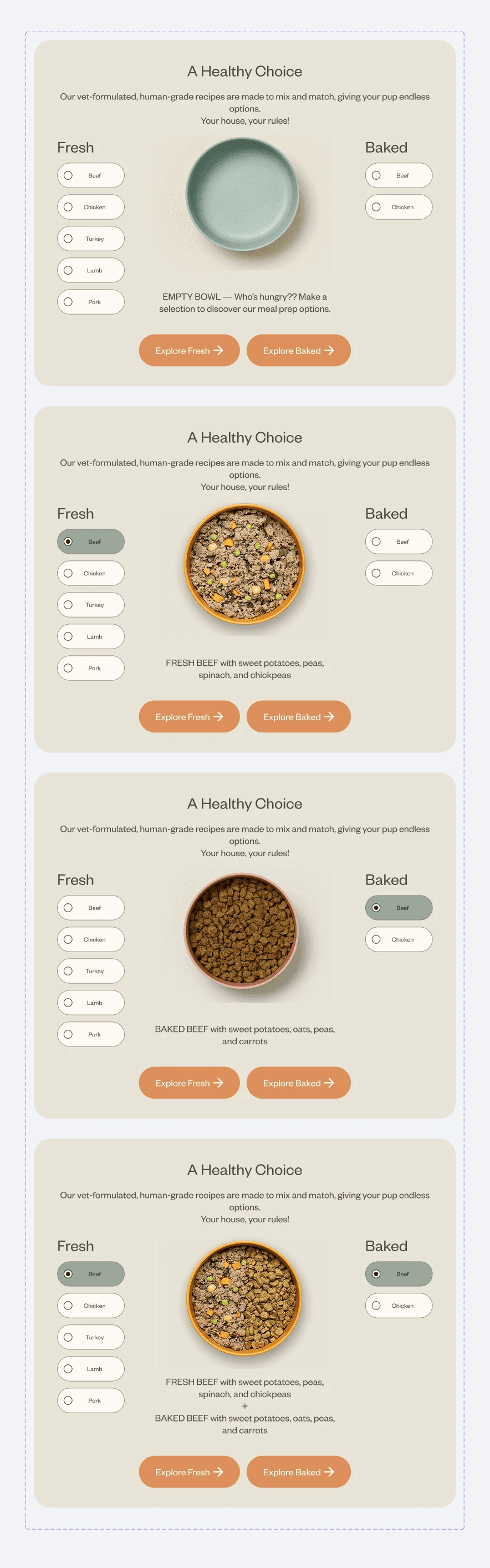
CARDS AND INTERACTIVES
Creating responsive and stylized components
After crafting the smallest elements of our design system, we moved on to the bigger pieces: cards and interactives. These were all crafted to be responsive on various screen sizes.
Cards came with rules (ex: some cards exist without background fills in particular contexts, and others must exist in rows of 4) which were later outlined in our documentation.
One of my main roles was the visuals, so I designed all the cards and graphic interactives
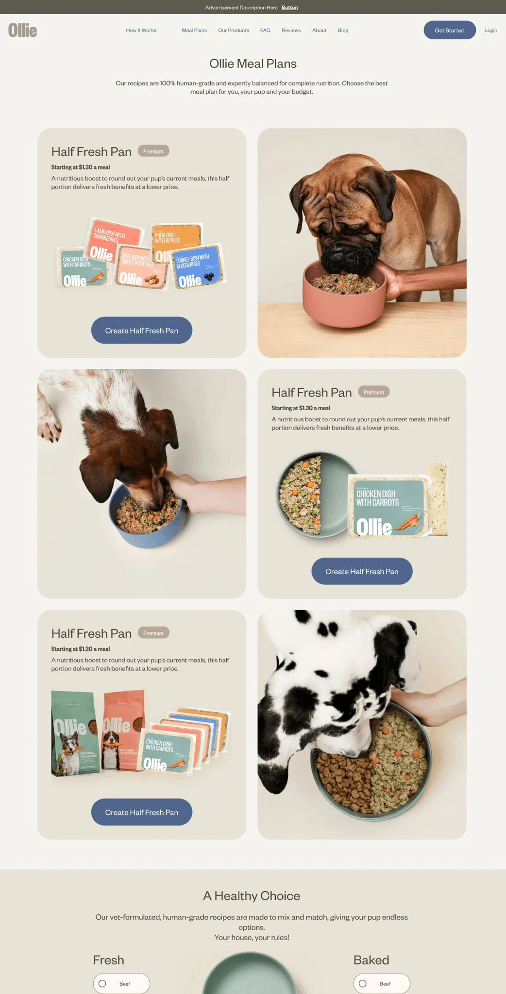
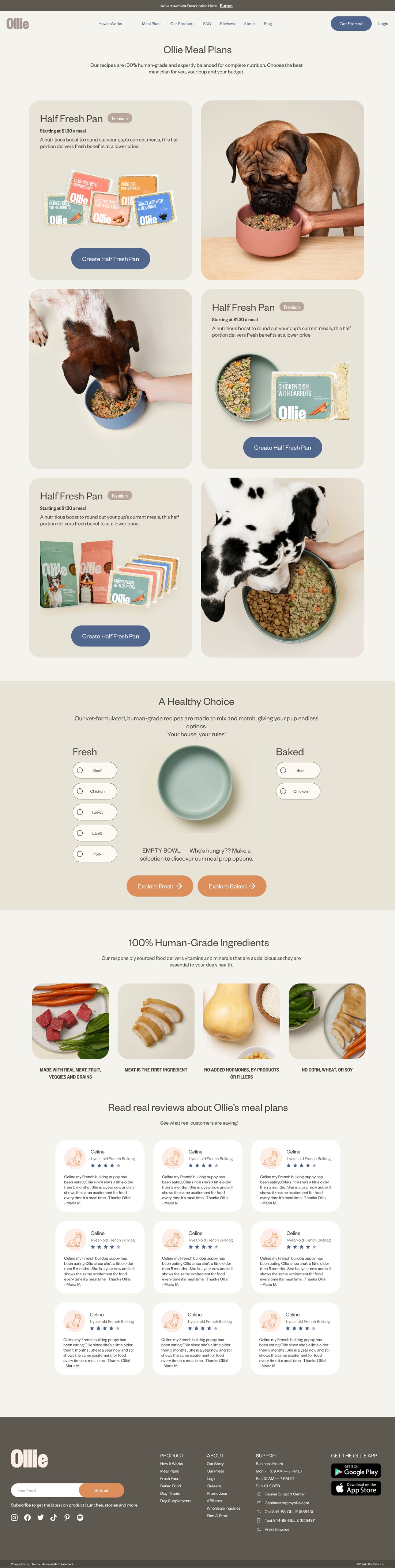
RECREATING OLLIE
We made a 1:1 recreation of Ollie's site to test our design
With our rebuilt and consolidated components, we ironed out the initial inconsistencies Ollie faced by not having a design system. We made an improved replica of the existing site.
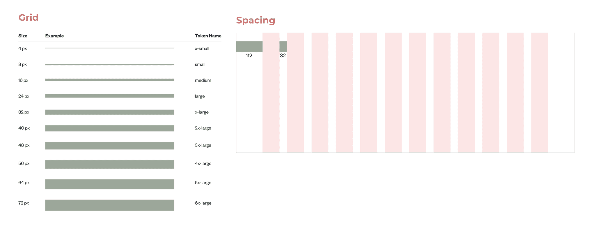
Improvements included the proper alignment of text, a standardized spacing/grid system, a reduction in colors, fonts, and cards, and a fully responsive design.
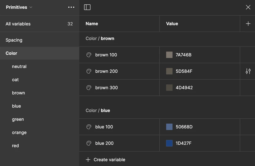
FUTURE PROOFING
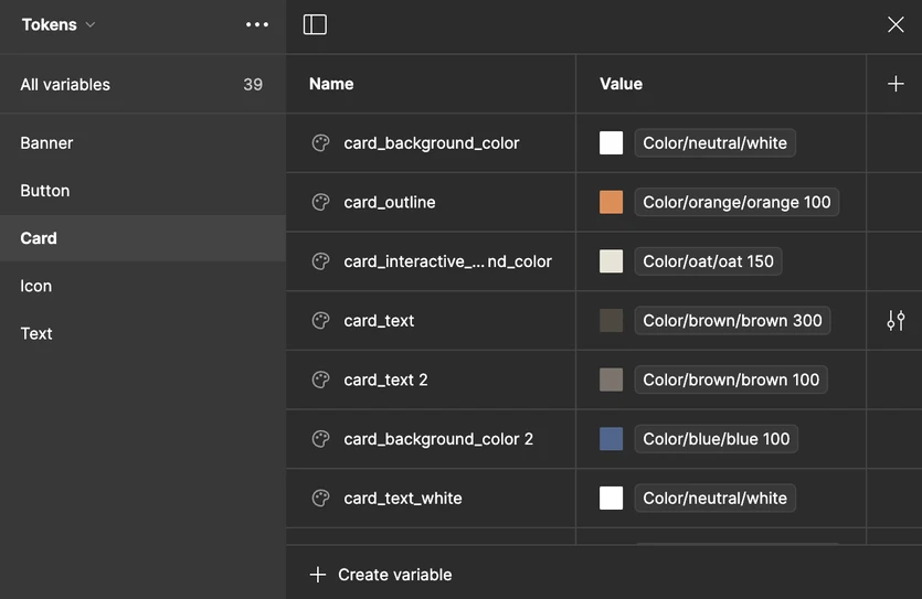
Design needs change over time, so we created tokens
Since we began our design with primitives, this future-proofed our system. Changing colors or values here applies to every component in the design system. This gives Ollie flexibility for future design changes without sacrificing time.
We then made tokens per component so designers can find the exact colors and spacing they need without cross-referencing a guide. We accounted for state changes as well. And, of course, having tokens makes handing off designs to developers easier as the design specifications are within Figma with universally understood names!
Ultimately, a design system is way more than a UI kit! It's a set of principles and guidelines.
RULESETS FOR DESIGNERS
Supporting consistency and efficiency in designers
While our Figma kit contains the building blocks of a design, it does not carry the instructions, nuances, and examples that best guide designers.
We used Zeroheight to document our design system, Woof. It includes comprehensive information such as use cases, dos and don'ts, contribution guidelines, official support such as Slack channel access, accessibility guidelines, resources, and more.