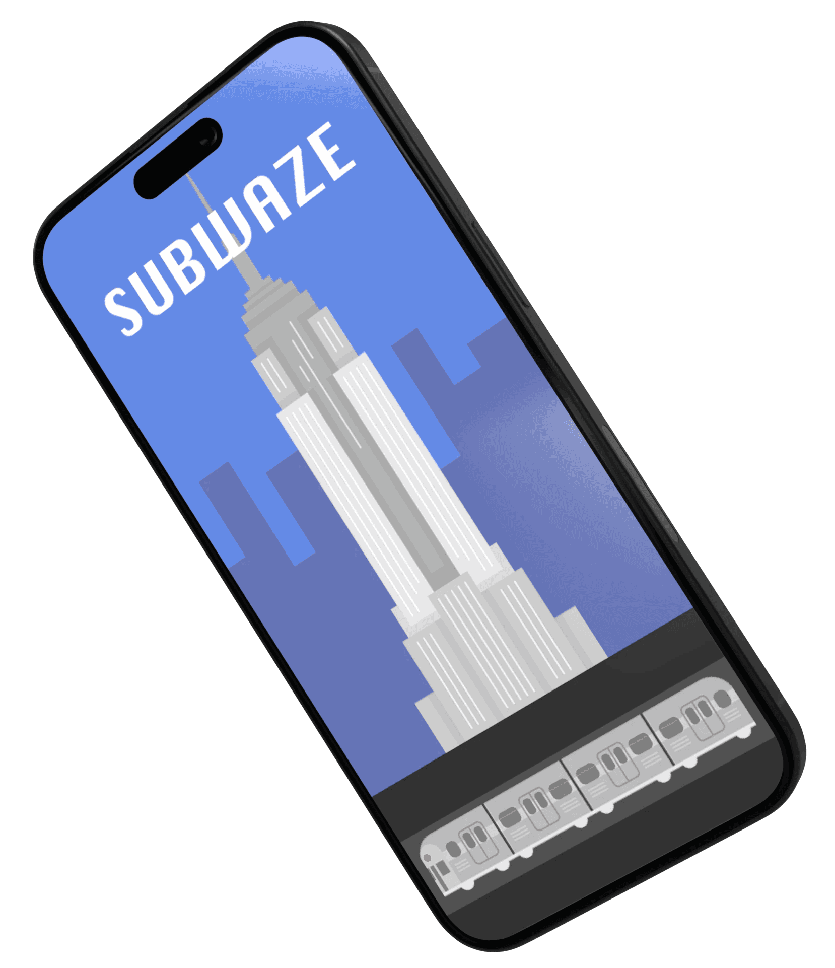
SUBWAZE
See real-time, customizable NYC public transit alerts to feel secure in the route you’re taking. Build a safety-first community by reporting incidents, and level up your avatar as you become a trusted reporter.
ROLE
DURATION
10-week academic project
TOOLS
Figma, Adobe Illustrator, Miro
TEAM
the problem
When asking a New Yorker about their experience with the MTA, you’d likely be met with a hollow stare, a pause, and a sigh. What will come after is a long-winded description of something frustrating, chaotic, or even downright frightening. It's a major problem.
our solution
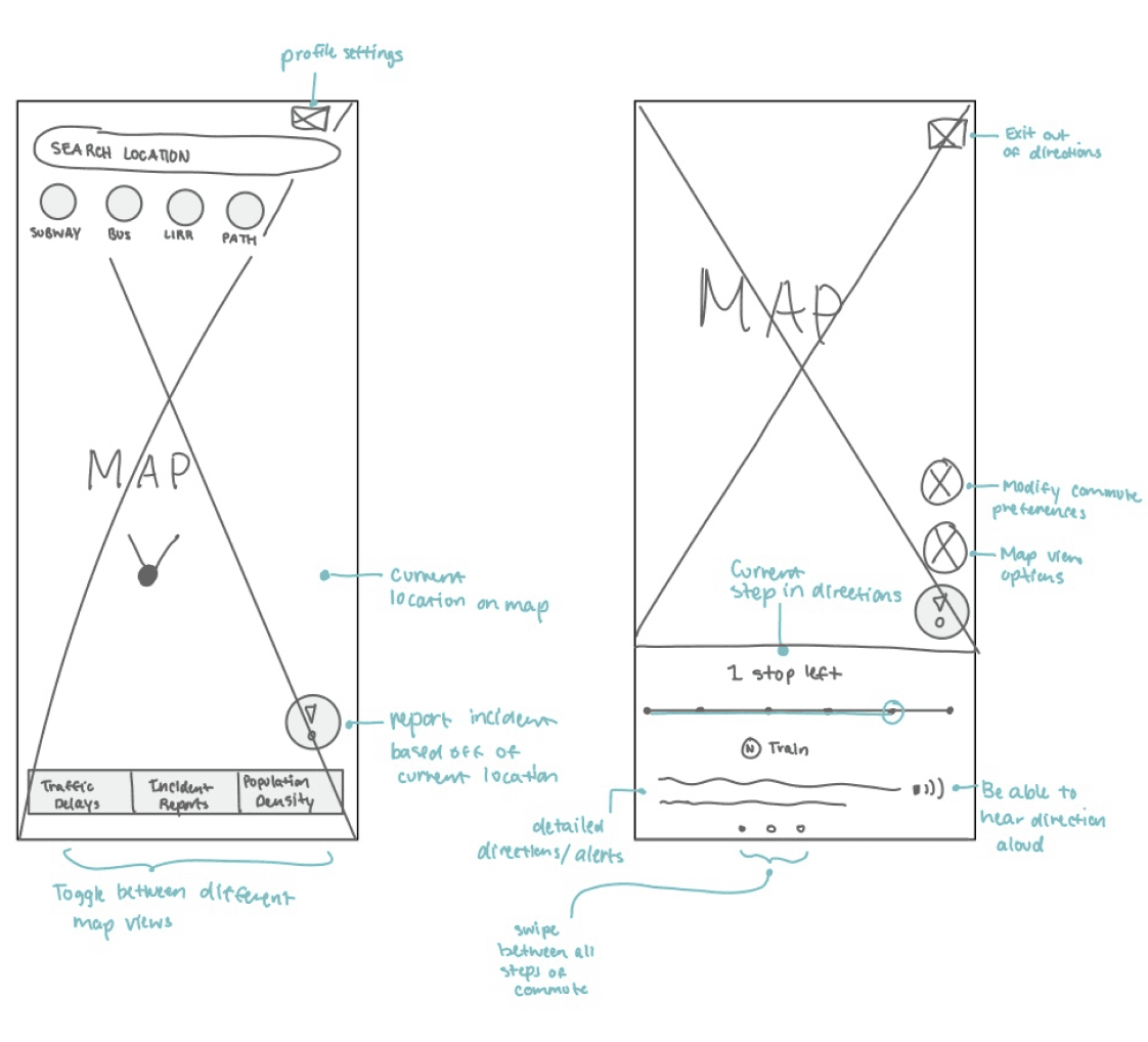
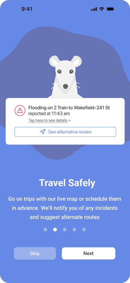
TRANSIT AWARENESS
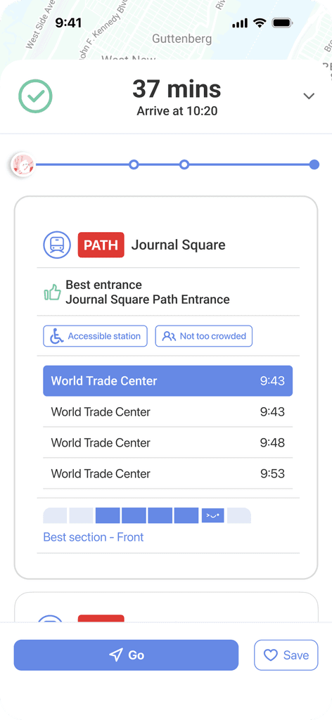
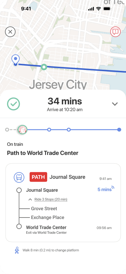
Be informed when traveling with our live route alerts
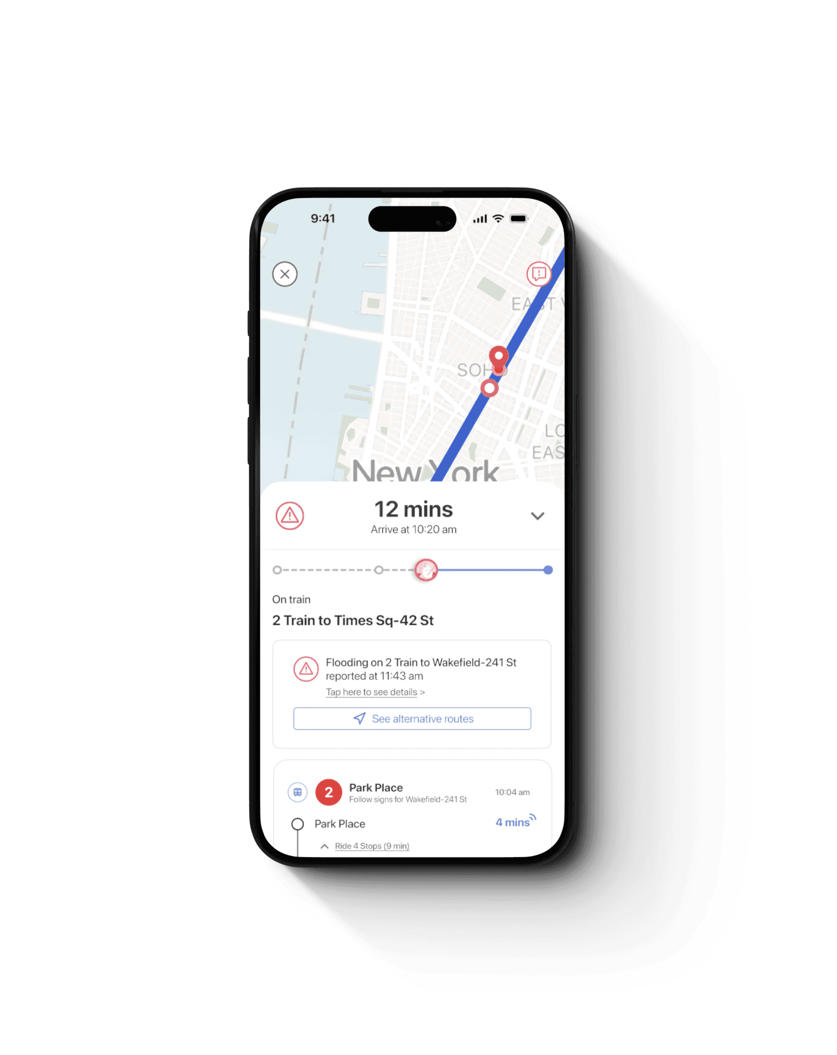
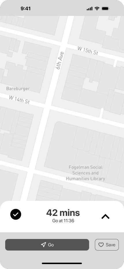
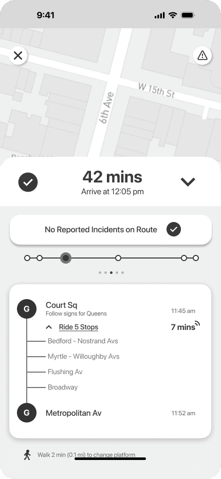
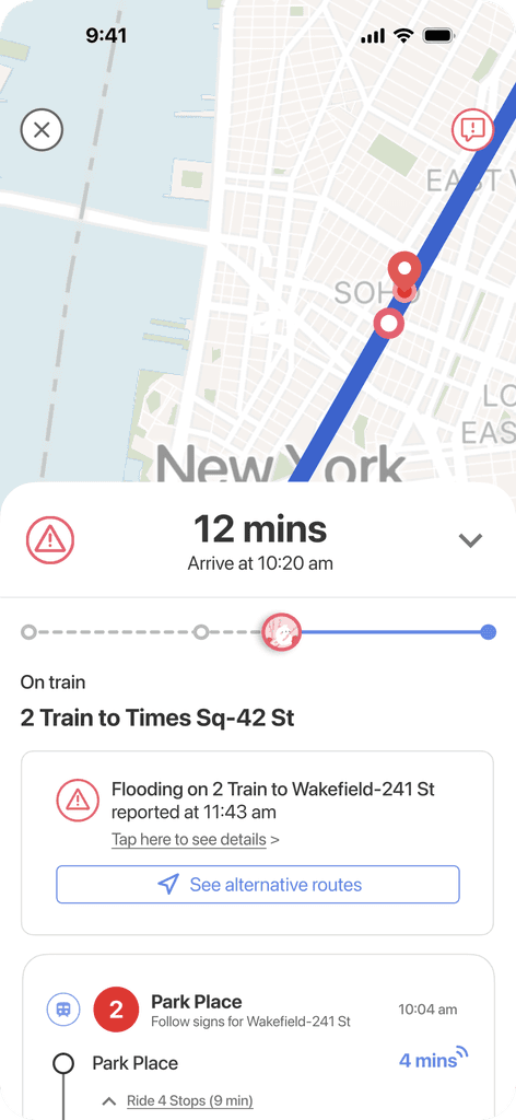
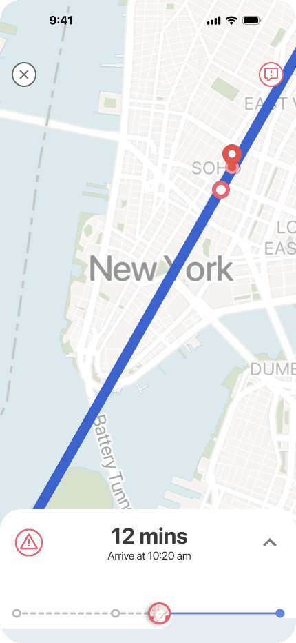
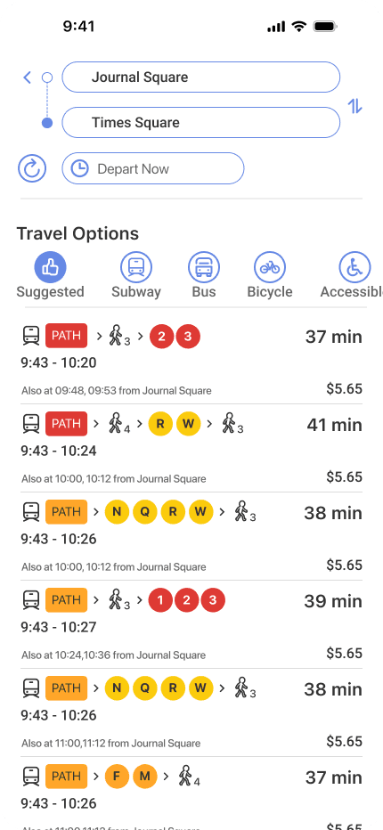
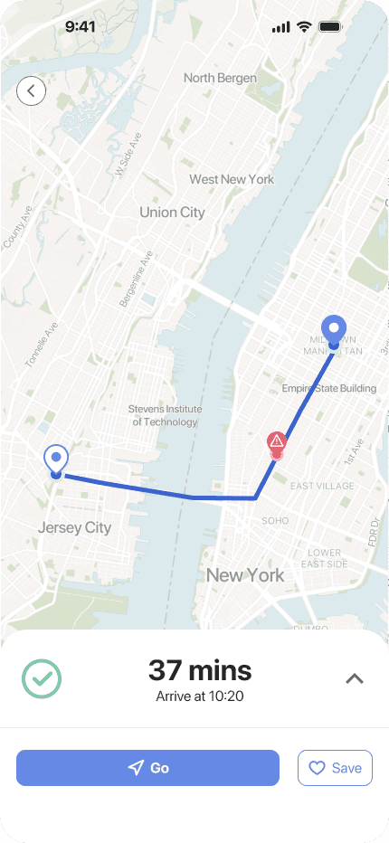
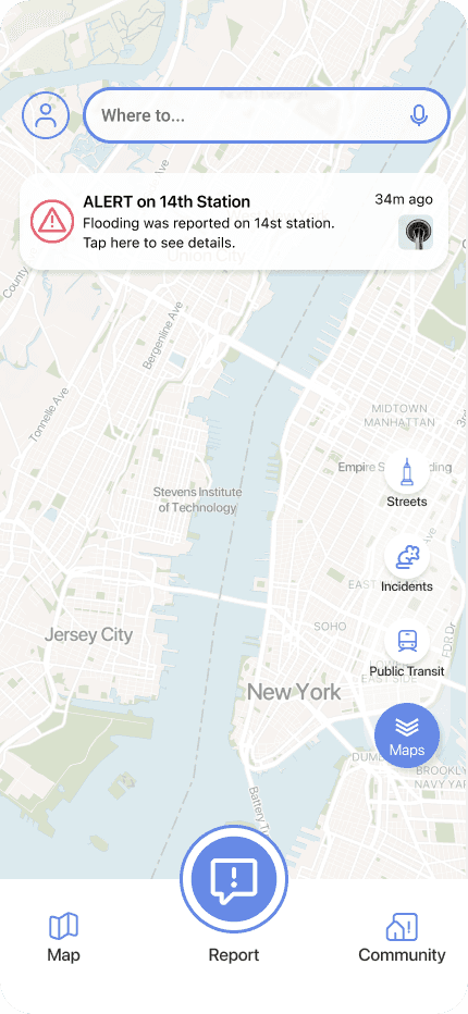
Knowing what to expect when you walk out the door can help prevent avoidable run-ins with trouble. SUBWAZE informs users of reported incidents while offering alternate routes, live transit maps, and accessible stations.
digging into research
Through surveys, persona creation, journey mapping, and interviews, we built an informed view of how to create what would become SUBWAZE.
CREATING OUR SURVEY
We wanted to learn about travel habits and mentalities
What were the incidents New Yorkers faced? How open were they to incident awareness and reporting? Aka: was there a need for our app?
We posted our survey on forums such as Reddit, SurveySwap, WhatsApp groups, and our personal circles.
Our survey had 38 responses, with 30 qualifying participants
27/30
had encountered train delays/trip interruptions
24/30
were open to checking for transit incidents via an app
24/30
have dealt with mild to severe transit incidents
20/30
were open to reporting incidents on their route
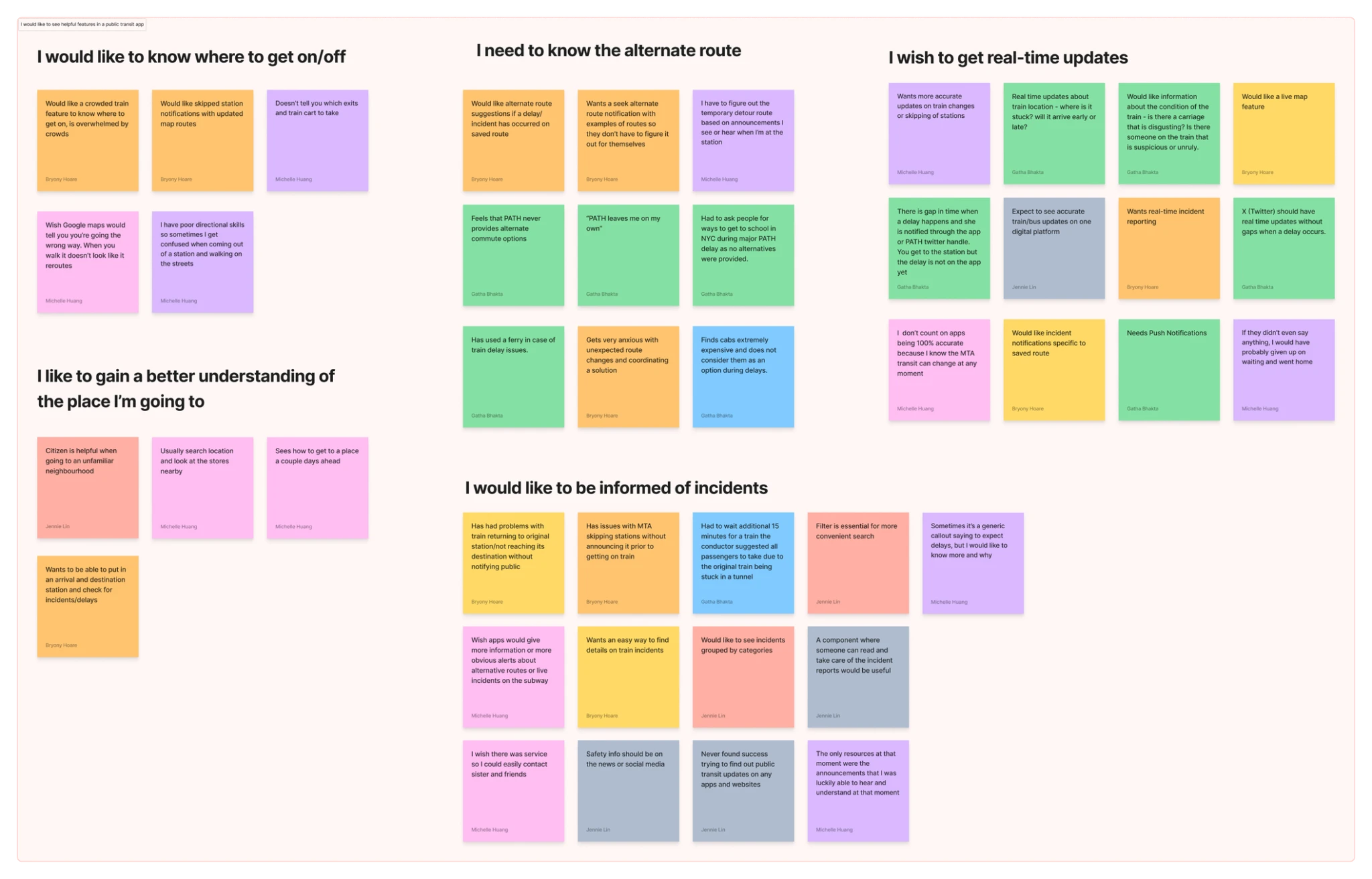
TOP PARTICIPANT FEEDBACK
Participants were universally wary of the MTA
The anxiety and frustration came across strongly. A few key features that interviewees kept circling back to were safety from other passengers, delays/lack of accurate timing, and not being aware of alternate train routes.
8/8
experienced discomfort due to other passengers
6/8
were willing to report incidents but wished it was easy to do
5/8
showed a preference for real-time updates/features
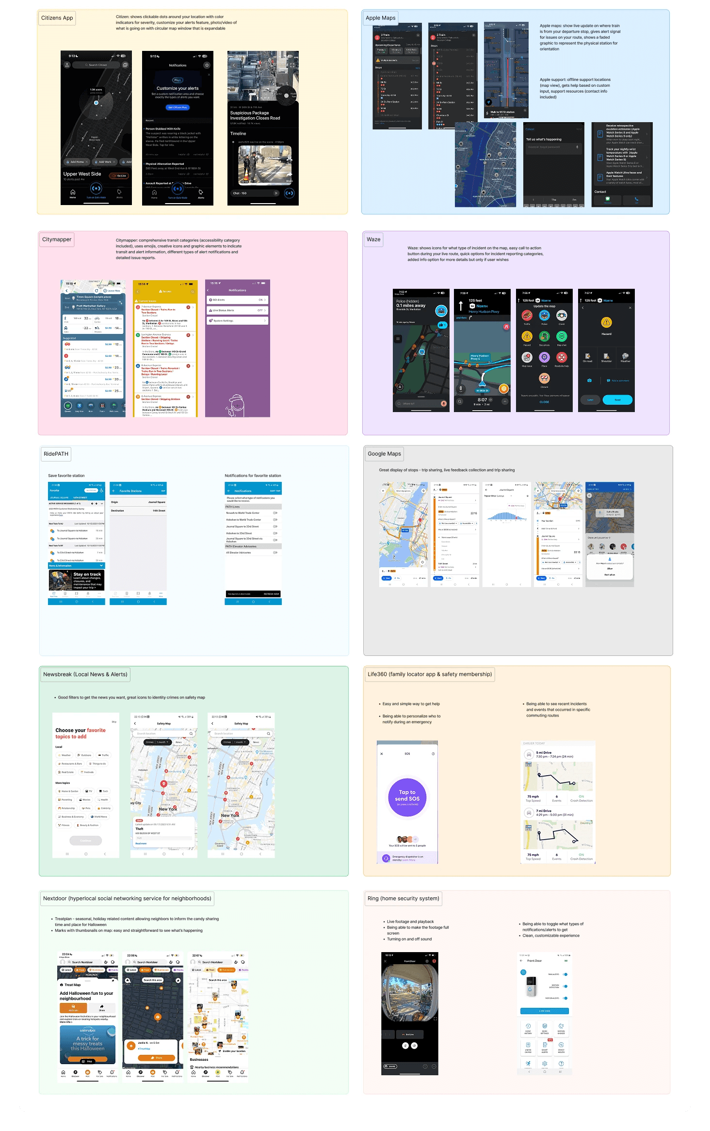
ideation phase
Our research into direct and indirect competitors included apps like Citizen, Apple Maps, Citymapper, Waze, RidePATH, Google Maps, Newsbreak, Life360, Nextdoor, and Ring helped inform our earliest product sketches.
COMPETITOR FINDINGS
We needed to see what features to incorporate
Key features were a high-visibility CTA, personalized notifications, real-time location tracking, custom alert icons, and attachments.
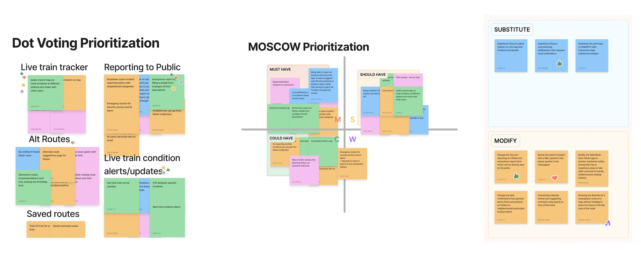
Priority #1: live transit notifications
Users wanted reliable and timely information to feel secure in their transit decisions.
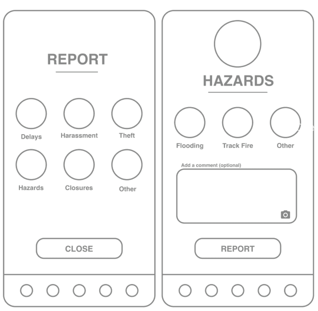
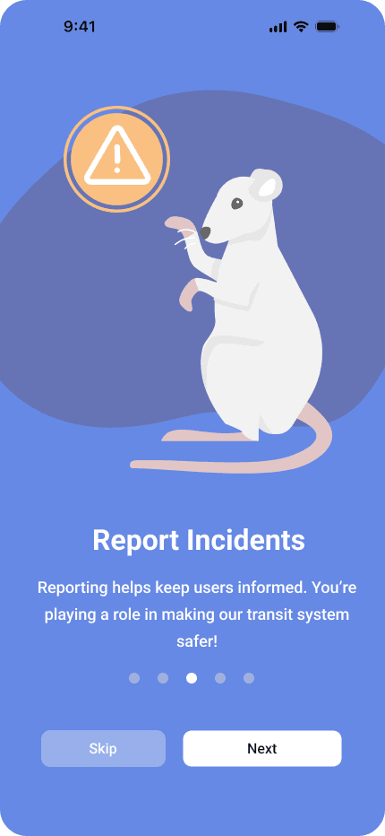
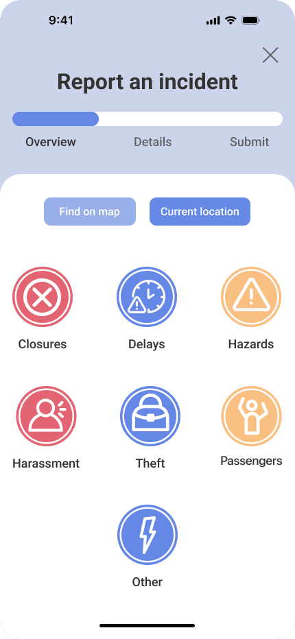
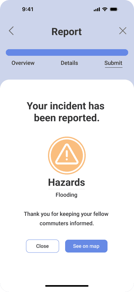
Priority #2: report incidents to the community
The ability to increase awareness was a big draw to our app idea. This boosted the app's community feeling.
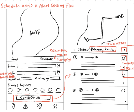
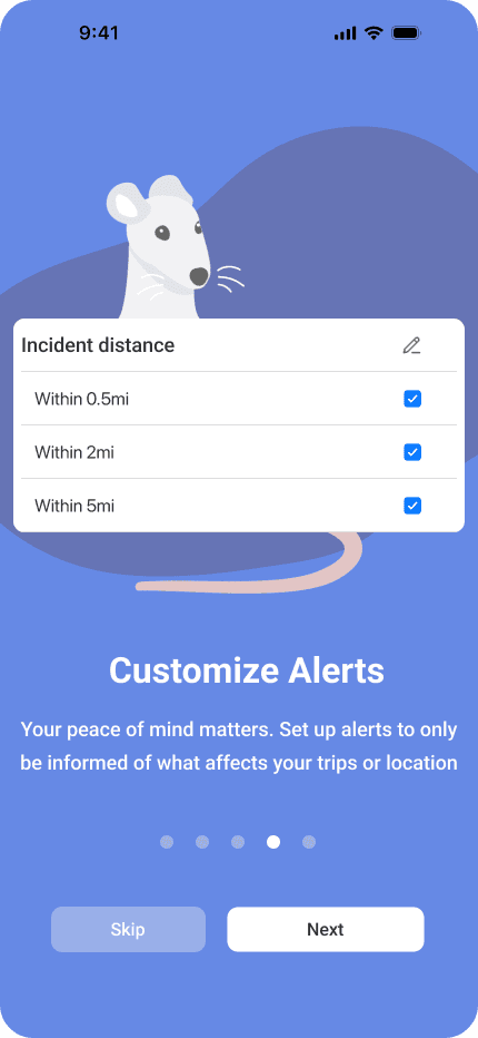
Priority #3: schedule trips and customize alerts
Users wanted to save regular routes (like a work commute) to minimize the mental effort of checking the app.
EARLY SKETCHES
We jumped on sketching our potential design solutions
Having found what features we wanted to focus on, we sketched our rough ideas for how these might take form.
The data we collected from these interviews pointed towards lived experiences that supported the need for an app-based solution.
early prototyping
We needed a clear structure to start building our app, so we began with building a user flow. This gave us the foundation for reliably visualizing our app. We did 2 rounds of development before settling on mid-fidelity prototype designs for user testing.
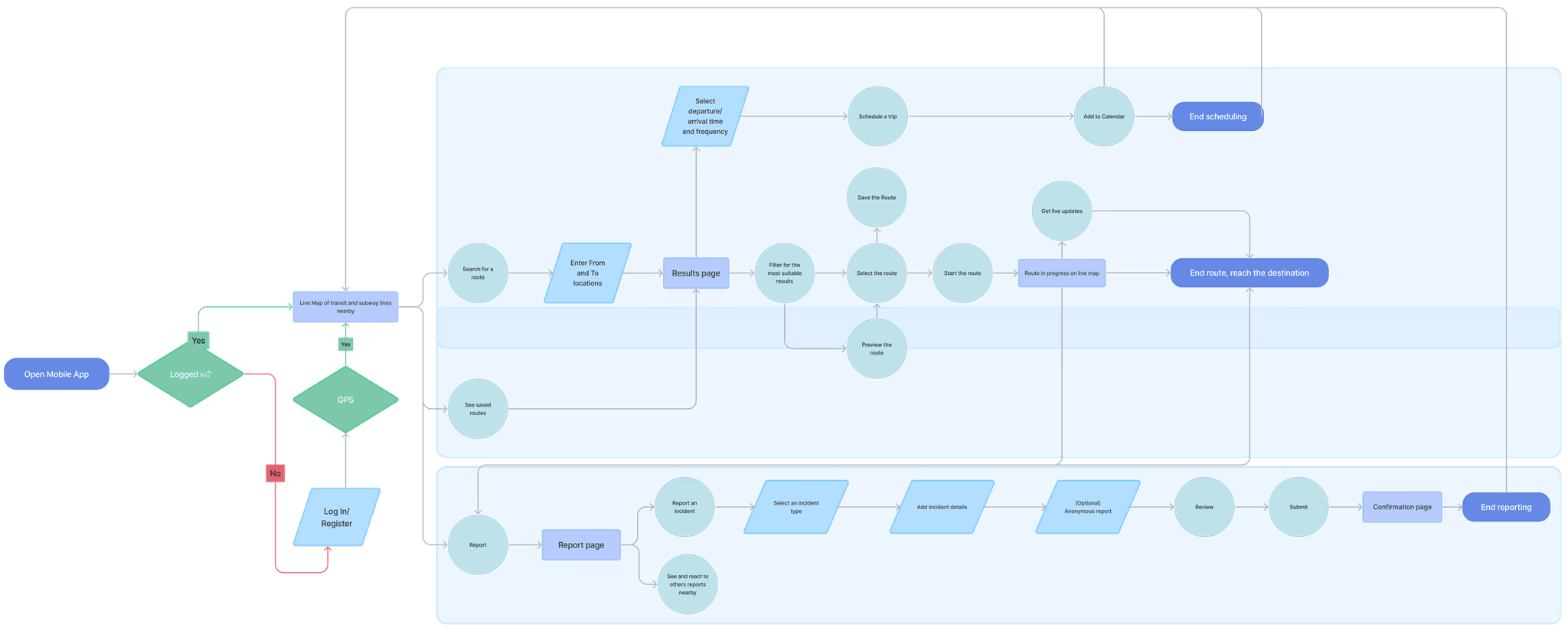
MID-FIDELITY PROTOTYPE
We optimized our original design sketches
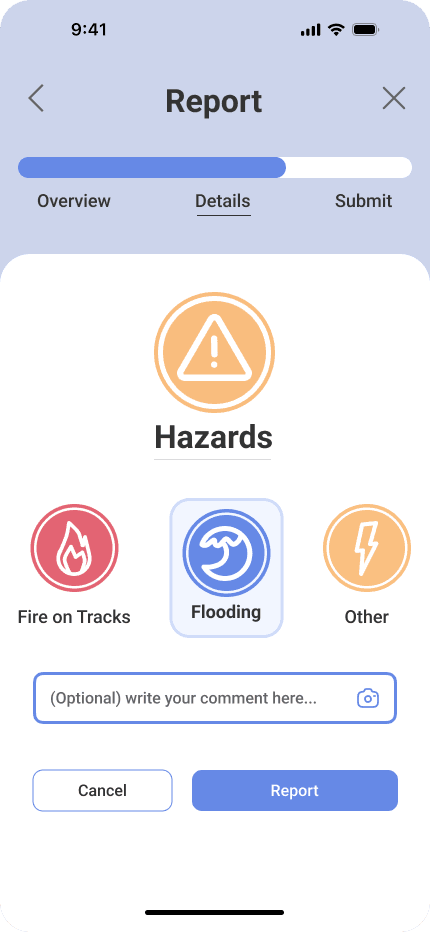
Our main design considerations included refining the information in status messaging, optimizing the number of screens/interactions to perform actions like reporting, and focusing on recognizable visual cues for a lightened mental load on our users.
We also added interactions to our designs to prep the prototype for testing
user testing
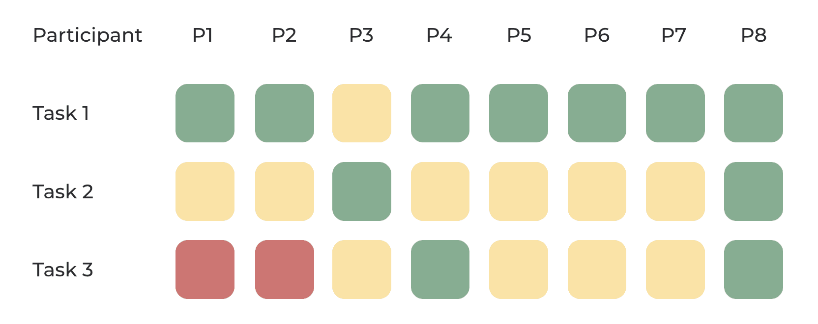
We set out to test our mid-fi prototype on 8 users. All tests were moderated, with 4/8 being in-person and 4/8 being remote.
TEST GOALS
We tested 3 core flows based on our feature priorities
Given that our app was map-based and could be used in high-stress moments, we had to be sure that our features were clear and easy to use.
Our tested flows were taking a route and checking for incidents during the trip (task 1), reporting an incident (task 2), and setting up alerts for a daily commute (task 3).
Legend: green = success, yellow = some trouble, red = could not complete task
final design
We used a soft color scheme and rounded edges for our UI containers since we wanted to lighten the nature of the app. These design choices made it friendlier and not so bleak, which is critical when it contains some potentially heavy material.
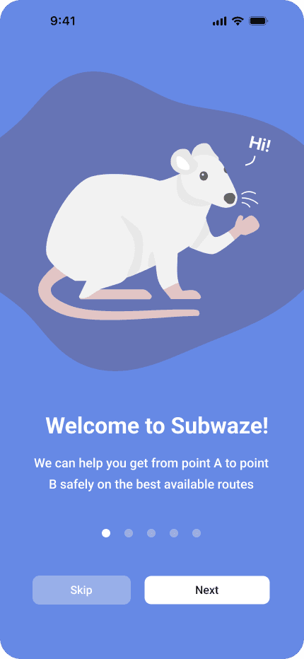
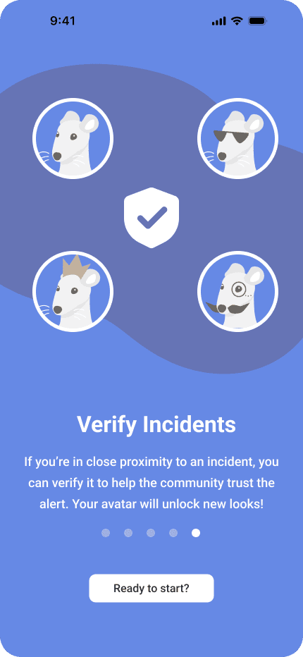
ONBOARDING SCREENS
Welcome to SUBWAZE!
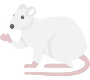
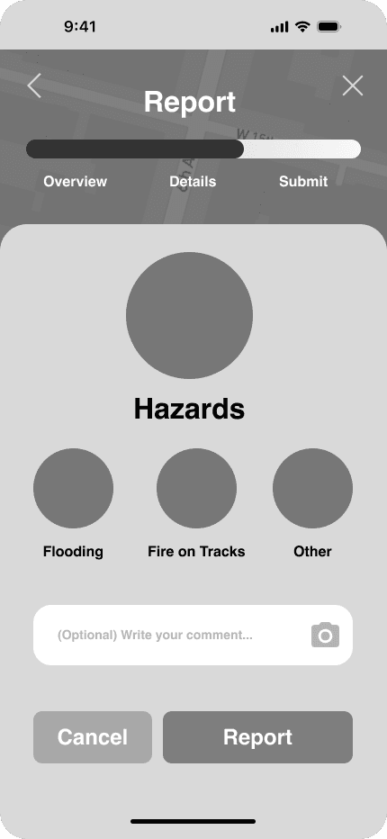
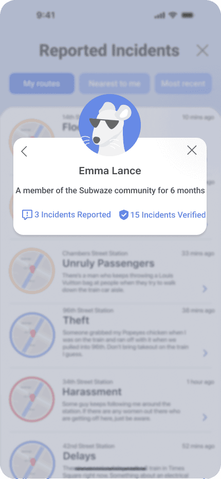
We wanted to encourage users to report incidents by making reporting feel gamified and minimizing anxiety. We also wanted a distinctly NYC design, using a classic subway rat as our app’s mascot.
I drew and animated all the custom vector illustrations in Adobe Illustrator and Figma

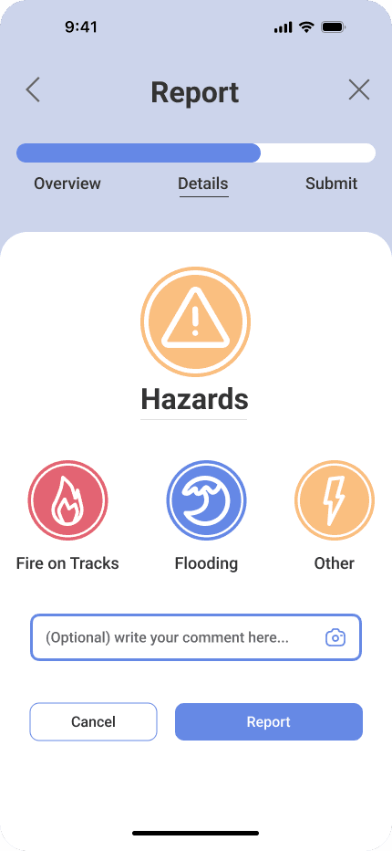
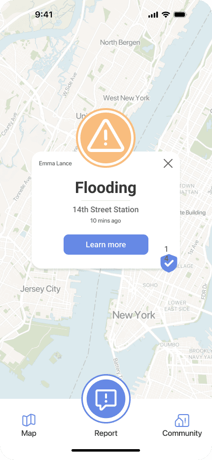
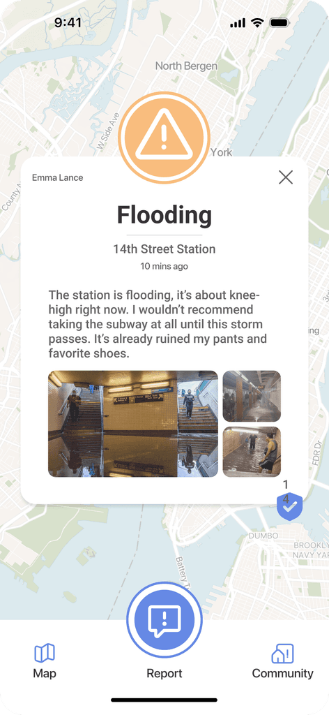
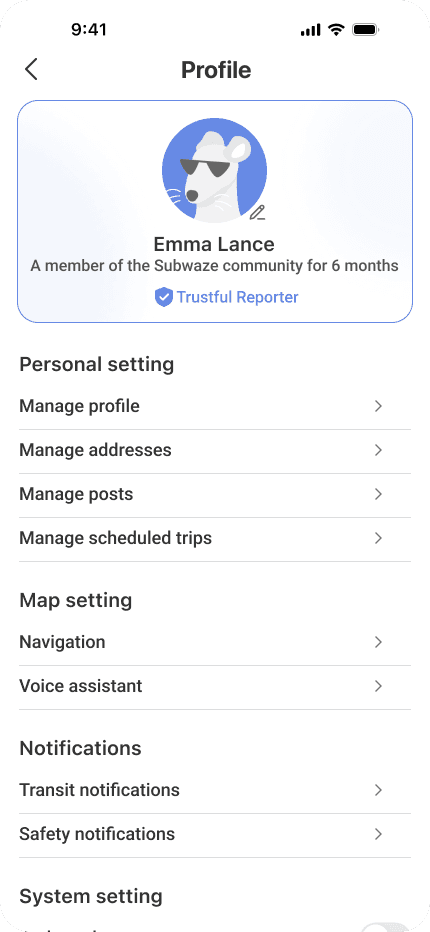
BUILDING A COMMUNITY
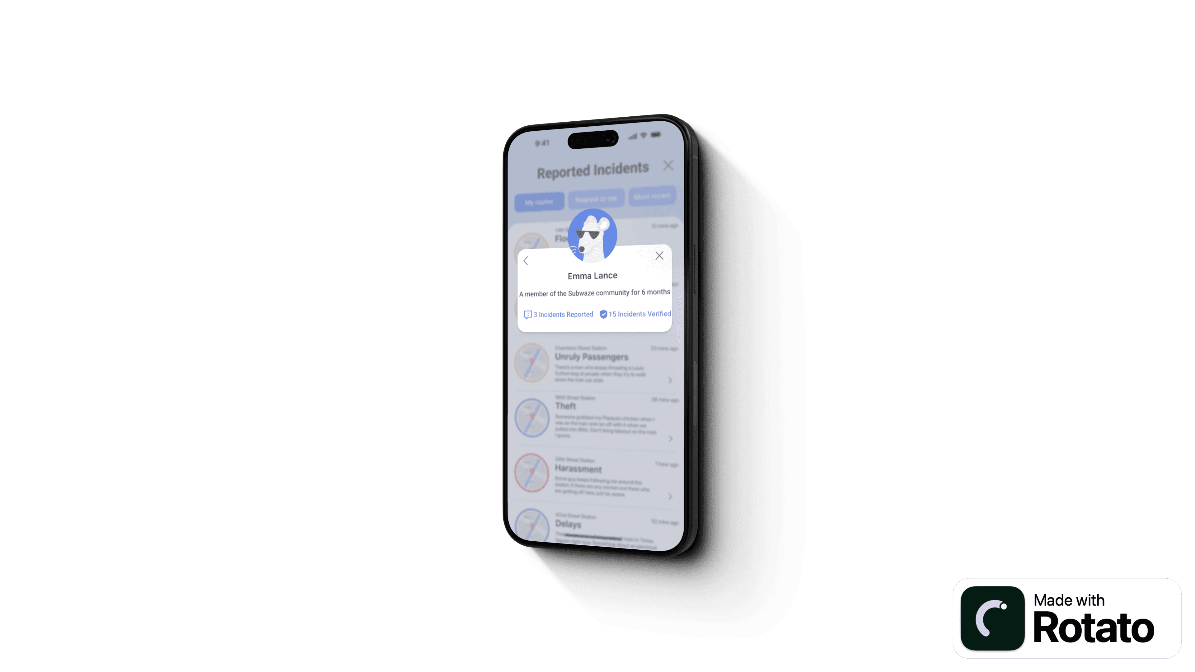
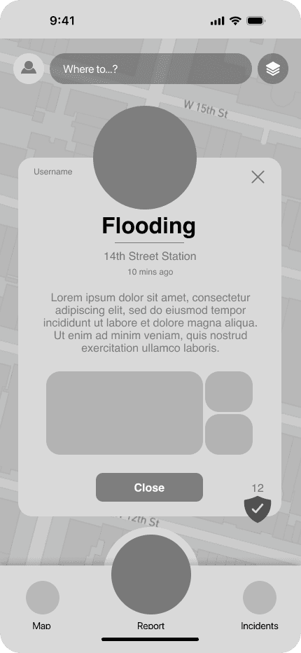
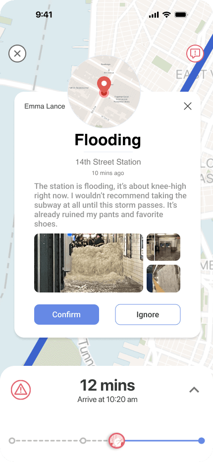
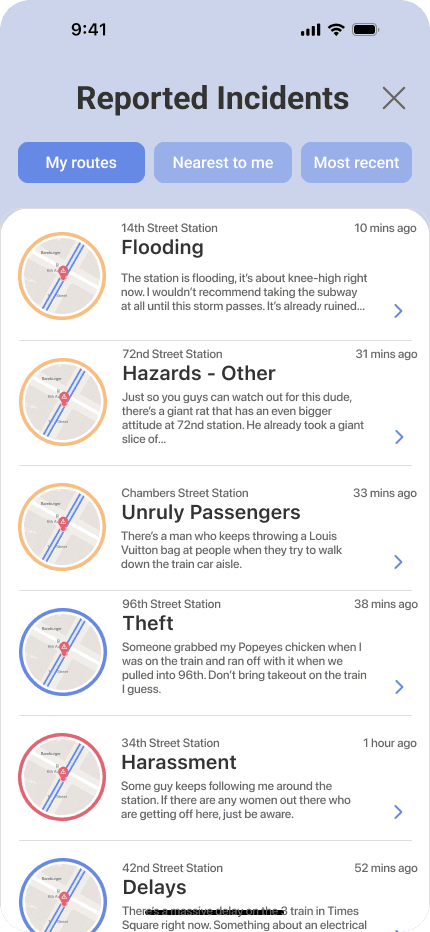
We included a forum to view relevant reported incidents
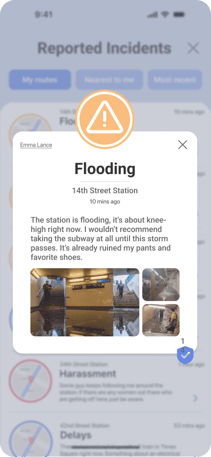
Community was one of the elements we wanted to focus on. We created a feed to show incidents that are most relevant to the user with optional filters. Users could validate incidents they also witnessed in the forum and explore the profiles of those who reported them.
To add a gamified element, users with the most validated reports can level up their rat avatar with unlocked accessories.
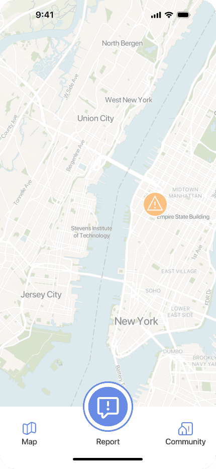
The forum can be accessed from the community icon or through an incident icon on the map
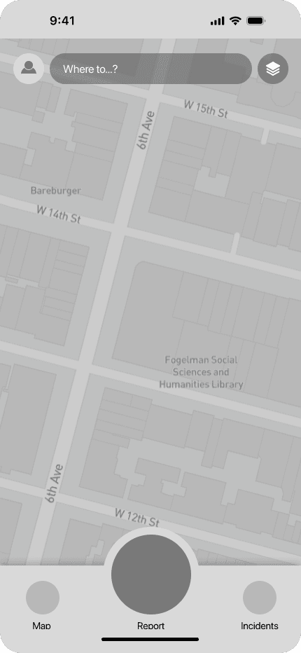
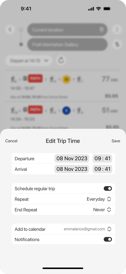
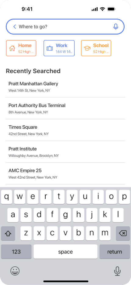
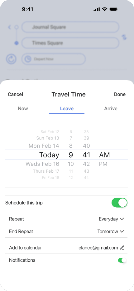
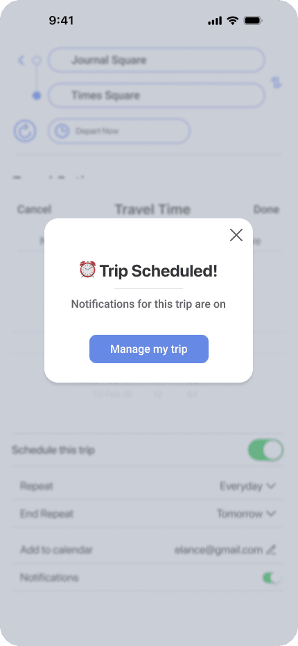
MANAGING YOUR TRIPS
Only hear about what's most relevant to your commute
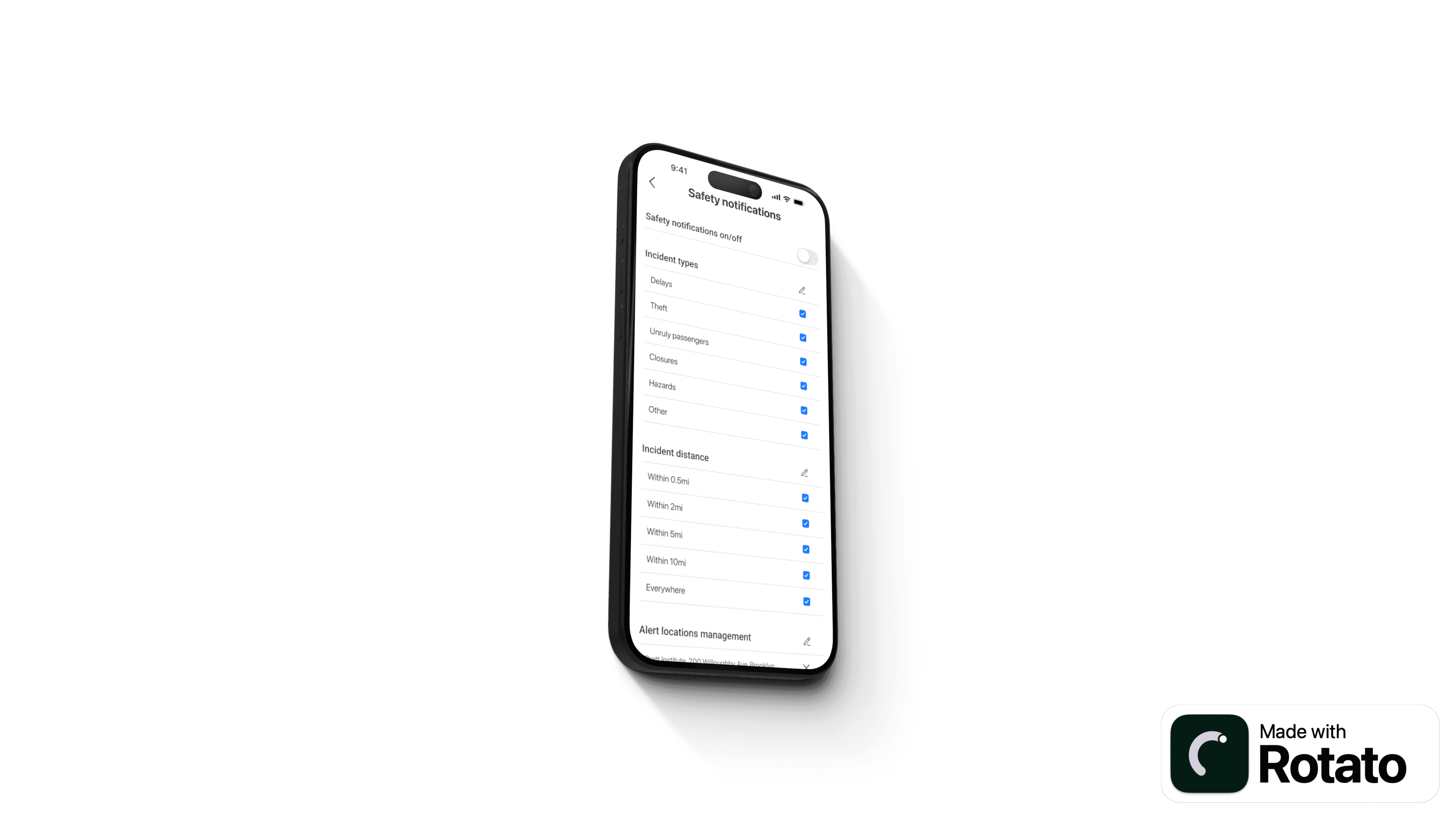
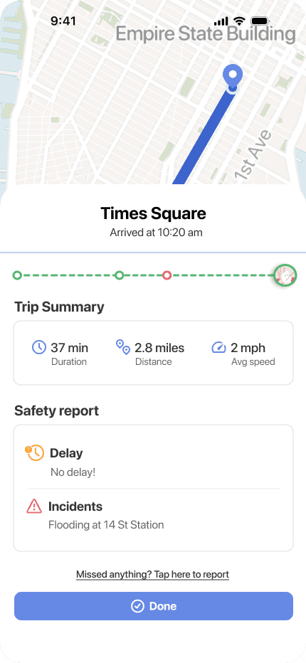
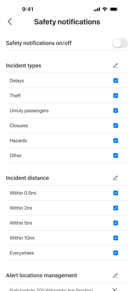
Our users wanted predictability when going on their daily commute. But there’s a balance between staying informed and peace of mind.
That's why we incorporated a scheduling feature to only show incidents specific to saved routes. We don’t want our users to be bombarded with negative information, so we also made an option to filter incident notifications.
final thoughts
SUBWAZE was a fantastic learning experience in the full product development lifecycle. We also benefitted from constructive critiques from a panel of industry experts working in product design at Amazon Music, Sony Music, ZocDoc, and FanDuel.
Thanks for reading!